

| |
|
 05-12-2006, 09:57 AM
|
#2541 |
|
Yeeeah, son.

Join Date: May 2005
Location: Stranded in the middle of the ocean with no desire to be rescued.
Posts: 755


|
Hey, I thought I'd post something up. It's a picture of a female Ritualist from Guild Wars. It's from the newest expansion that came out like a week ago. I really like the Ritualist class in general so I thought I'd do this. This took a total of 16 hours in photoshop. I used the pen tool for the outlining and the burn and dodge tools (along with others) for the shading and such. I hope you like it!
 |


|

|
|
05-12-2006, 10:17 AM
|
#2542 | |
|
Cheers!

Join Date: Nov 2003
Location: Bright Light city
Posts: 7,589

|
Here are some other sketches from my sketch book
  Some fan art for the movie Battle Royale 
__________________
My Art Page Quote:
|
|
|
|
|
|
05-12-2006, 08:50 PM
|
#2543 | ||
|
Hehehe... Splode!

Join Date: Mar 2006
Location: Purgatory
Posts: 45
|
Love the drawings guys especially the ritualist. And don't know how ayone can draw in pen cause its so frustrating when you make a mistake but great job. Here's a character from my friends story that I drew for her. Any critizism would be nice.
__________________
Quote:
|
||
|
|
|
|
05-12-2006, 09:17 PM
|
#2544 | ||
|
Cheers!
Join Date: Nov 2003
Location: Bright Light city
Posts: 7,589
|
Quote:
__________________
My Art Page Quote:
|
||
|
|
|
|
05-12-2006, 09:42 PM
|
#2545 |
|
Yeeeah, son.
Join Date: May 2005
Location: Stranded in the middle of the ocean with no desire to be rescued.
Posts: 755
|
I feel like critizing, and I am. So there...
Squishy: 1. I really like the design for the robot. The thing that bothers me the most is its torso. It seems that it's angled wrong or something. Everything else is cool. 2. I find this piece to be very interesting. The only thing that irks me is her face. It seems to be a bit wide. What I'd recommend is to make the sides of her face skinner and it'd be perfect. 3. Not really a lot of things on this one. What sticks out to me is that the wrist is too wide. Other than that, it looks pretty cool. Niko: I fuggin' LOVE the details on the wings. I think the eyes seem a bit too long. Her left eye (viewer's right) seems like it runs past her nose. Also, her arms looks wonky. Everything else is awesome! |
|
|
|
|
05-12-2006, 09:55 PM
|
#2546 | ||||
|
Cheers!
Join Date: Nov 2003
Location: Bright Light city
Posts: 7,589
|
Quote:
http://tn3-2.deviantart.com/fs10/300..._by_Jadguy.jpg Quote:
Quote:
__________________
My Art Page Quote:
|
||||
|
|
|
|
05-13-2006, 01:36 AM
|
#2547 | |
|
Doesn't care anymore

Join Date: Mar 2004
Posts: 2,429

|
Quote:
Zutsujin, a few things I noticed that could use a little improving. I love the pen outline by the way..something I really need to practice with. That blasted pen eluding me all these years.. Anywho, her upper arm. Its looking a little....droopy. The bicep is more than a tad lower than it should be. And yes, it is stylized but that part just really stands out like a sore thumb. As for the coloring, I used the burn and dodge tool a lot in my day and as such I have a few pointers for you to do with as you will. Use hard edged brushes at a low transparency and low flow percentage. Although it means you have to click more often for a full color you'll have more control over the amount of color you want put down. This second bit will come off as a little blunt: Drop burn and dodge altogether. Use the brush tool like I mentioned above if you want to go for a blended look. You could also go for a cell shaded style. 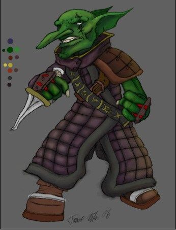 that is what the pen style I just told about ends up as (yes I drew that and I've been too busy to finish coloring the rest of him.) The reason why I ditched the B&D tool entirely is because the colors were natural enough. It screwed up the colors instead of mixing them together. I will link to when I used to use Burn and dodge tool over a base color layer.. 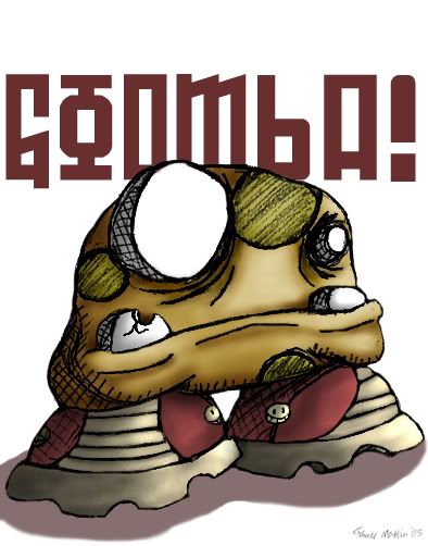 B&D gives things a 'plasticy' feel. Too unnatural in the shading and coloring. I often had to use the sponge tool on saturation with varying percentages set to get a semblance of the original color back. It became too much of a hassle so I adopted a new coloring style. You can see quite a big difference in quality between the two coloring methods. I hope this was useful instead of condescending. I really enjoy the ritualist drawing. I'm just attempting to giving you a nudge in a better direction from what I've learned. and heres a little mouse doodle I did to kill time 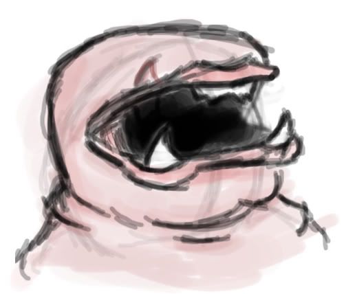
Last edited by Grandmaster_Skweeb; 05-13-2006 at 02:19 AM. |
|
|
|
|
|
05-13-2006, 01:18 PM
|
#2548 |
|
DA-DA-DA-DAA DAA DAA DA DA-DAAAAAA!

Join Date: Dec 2003
Location: Zanzibar Land
Posts: 6,531
|
ZJ- That might be one of my favorite drawings I've seen you do. I love the look and overall feel to it. Great work with details. The one thing that bugs me a little bit is the toes. I can't help but feel that ones facing us are a bit smushed looking. Other than that I simply adore the picture. Teach me how to do cool tatoos!
Squishie- Love the composition of the first one. Weird, but funny. For the second picture The blood bugs me the mostly. It looks a little too haphazardly placed. As someone told once before about drawing blood- blood likes to spatter-spattering is it's favorite activity, so maybe doing some little spatters around the bigger marks of blood would help it. The last one is good. I would point out the wrist but that's already been taken care of. Overall good job. ^^ Skweeb- Nice mouse doodle. Although I think I may have nightmares about that creature. ^^ You always draw such unique stuff. After getting over my insecurity of posting more FMA art, I decided I draw what I draw so I shouldn't worry too much about it. This is just a little picture I drew as fanart for a fanfic one of my friends wrote for me. This is from a scene where Ed is sitting in front of the fire with a cat he recently rescued from a tree in a storm.  He turned to face the kitten, nose-to-nose with the little fluffball. "It's okay now, kitty, you're out of the storm, you're dry in probably the nicest place you've ever been in your short lifetime, so... could you please let go of my sholder?!" The kitten began purring in response, and Ed could feel twitches in it's front paws meaning it would soon be kneeding them in and out of his skin. It was going to be a long night. EDIT: here's another fanart I did from another one of my friend's FMA fanfics, I found it humorous. 
__________________
 Last edited by CelesJessa; 05-13-2006 at 09:52 PM. |
|
|
|
|
05-14-2006, 09:48 AM
|
#2549 |
|
none the wiser

Join Date: Oct 2004
Posts: 149
|
more mindless pap from the tweebus peanut gallery...

|
|
|
|
|
05-14-2006, 12:59 PM
|
#2550 |
|
Doesn't care anymore
Join Date: Mar 2004
Posts: 2,429
|
Yay for mindless pap!
|
|
|
|
 |
|
|


 Linear Mode

