

| |
|
 07-02-2010, 03:04 AM
|
#4401 | |
|
Blue Psychic, Programmer

Join Date: Feb 2007
Location: Home!
Posts: 8,814


|
Soooo... remember The Power of Commands? Well, it's stalled right now awaiting an overhaul and I haven't done anything with it in ages due to its size, but I was taking a look at it today and decided to make the interface workable. I'd previously taken it for use with Feng, but I decided to bring back parts of the original 640x480 interface.
 I pulled and modified the movement plate to fit into the smaller area and copied the gems from the corners of the frame to the corners of the new window, then decided to pull the remaining colors in from the logo to extend a game mechanic I had planned for better emotional impact. I'll probably be doing more with this tonight.
__________________
Quote:
Journal | Twitter | FF Wiki (Talk) | Projects | Site |
|


|

|
|
07-02-2010, 08:49 PM
|
#4402 |
|
Yeeeah, son.

Join Date: May 2005
Location: Stranded in the middle of the ocean with no desire to be rescued.
Posts: 755

|
Large dump time!
Decided to fool around in paint.
 Sunkern! Drawing with with a 1 pixel brush is very tedious, but really fun.  Just a quick sketch. The more I look at the polaroid, the more I realize the face looks like that one clown from Are You Afraid of the Dark?, and proceds to freak me out.  Just a tree. I 'm honestly proud of how I colored it.  It's Fry!  Not much to this one. Seriously proud of the feet, though. So there's that. 
__________________
The artist formerly known as 'ZutsuJin'. "It is not necessary for the public to know whether I am joking or whether I am serious, just as it is not necessary for me to know it myself"
|
|
|
|
|
07-03-2010, 05:33 PM
|
#4403 | |
|
Making it happen.

Join Date: Mar 2004
Location: Someplace. Probably here.
Posts: 7,879

|
The Sunkern and the tree look awesome, ST. Great work.
__________________
Quote:
3DS Friend Code: 4441-8226-8387  |
|
|
|
|
|
07-06-2010, 12:01 PM
|
#4404 | |
|
Blue Psychic, Programmer
Join Date: Feb 2007
Location: Home!
Posts: 8,814
|
So I did, in fact, do more work on the PoC interface and need some feedback on the menu buttons:
Text buttons:  My first draft, just whipped up for placement, but clear. Image buttons 1:  My second draft, with Menu left as text because I couldn't think of a good image. Image buttons 2:  With something for the Menu button, but I fear for clarity. Sidebar 1:  My first attempt at a sidebar to help the menu buttons match the arrow buttons. Sidebar 2:  Because I was afraid there was too much yellow. Sidebar 2b:  Just a pixel out further, which makes it match the width of the gems and gives equal width on all sides. Sidebar 2c:  Made smaller instead of larger. Sidebar 3:  Because I happened to be messing with the layers and it worked well. Sidebar 3b:  Sidebar 3 with sidebar 2b on top instead of sidebar 2. Sidebar 4:  Because maybe a lozenge would work to break up the yellow a bit? Which set of buttons is best? Which sidebar looks best? Is a sidebar even needed?
__________________
Quote:
Journal | Twitter | FF Wiki (Talk) | Projects | Site Last edited by bluestarultor; 07-06-2010 at 12:19 PM. |
|
|
|
|
|
07-21-2010, 12:32 PM
|
#4405 |
|
Local Rookie Indie Dev

Join Date: Dec 2008
Location: New Jersey
Posts: 5,497
|
I'd say Sidebar 2c looks better. Regardless of that, the layout is looking great so far.
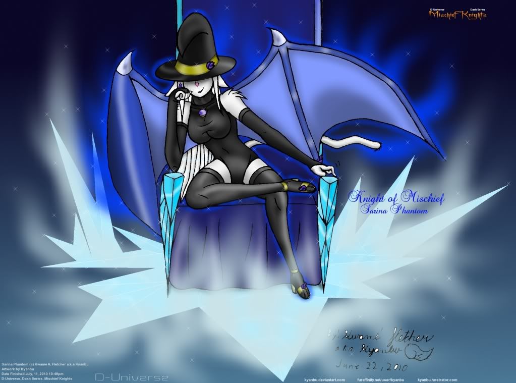
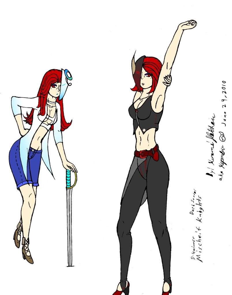
Knight of Mischief, Sarina Phantom Been debating about rather or not to stick with this color scheme for Viola and Violet's cloths before rendering it.
__________________

|
|
|
|
|
07-21-2010, 11:58 PM
|
#4406 | |
|
Blue Psychic, Programmer
Join Date: Feb 2007
Location: Home!
Posts: 8,814
|
Thanks for the feedback, Kyanbu. I think you're right. Breaking up the yellow as much as possible serves it best.
In other news, work for Ruby!  I've figured out how I'm going to handle movement animation. I was considering doing some fancy vector stuff, but then I realized that it would be way less painful, almost as effective, and much more in line with the target era to just flip my backgrounds every step taken. So I give you a mine shaft with fissures alternating per tile. That and a few other cues, such as maybe random rocks (not made yet) or clever use of passageways (also not made yet, sadly) will help the player orient himself. Edit: Here's a test I just whipped up:  Edit: Okay, I'm also in need of opinions not related to art. I'd make a thread for this, but, well, I really don't want a project thread again. I have several new skins made up, just recolors of the red one (which I in turn recolored a bit today to keep it from looking so flat). The issue is really that I only plan on doing three games. Ruby is part one of what may end up being a trilogy if it all goes through. I now have skins in red, blue, green, amber, purple, teal, and "turquoise" that's done up to look vaguely like the stone. At most, I'm only willing to extend it to a fourth game, because that's all I can see myself being able to come up with to fill out the world. After that, I'd just be milking it, and, quite frankly, I'd rather not let it take up the rest of my career, no matter HOW popular it could theoretically get (then again, look at Kojima). I'm therefore left with 3-4 extra skins (unless I somehow end up like Kojima). So my question becomes: should I keep them in reserve? The original plan was to reward a certain amount of donation with a colored skin, rather than the default stone. The colored patterns are in fact different than the pattern of the default skin, so it's an easy matter of just packaging the premium version with the file and some new code to open up the options to change it. I also happened to remove all skin backgrounds by accident and stumbled across what I've named the "Minimalist" theme, which seems fair to toss in for those who like a really clean, almost sleek, look. Like, I really like it, which is goofy given the work I put into all the actual skins. XD As I see it, the free game gets the default skin and maaaybe Minimalist, but not likely. The paid versions will each get a gem-themed skin, Minimalist, and code to swap skins and cursors (of which I also have more than one bitmap and recolors besides). What I'm wondering is if I should package one of the other skins in with the paid version (it is, after all, a simple matter of swapping the palette once you have one), release them as a download pack for a nominal fee, or just hang onto them in case I need them later.
__________________
Quote:
Journal | Twitter | FF Wiki (Talk) | Projects | Site Last edited by bluestarultor; 07-22-2010 at 03:11 PM. |
|
|
|
|
|
07-23-2010, 07:40 PM
|
#4407 |
|
Yeeeah, son.
Join Date: May 2005
Location: Stranded in the middle of the ocean with no desire to be rescued.
Posts: 755
|
So I randomly drew a picture of a Typhlosion, and I'm like, really proud of it. I might have taken it a tad overboard on the fire, but it was really fun drawing that, so I figured I'd keep rollin' with it beyond what might've been necessary.

__________________
The artist formerly known as 'ZutsuJin'. "It is not necessary for the public to know whether I am joking or whether I am serious, just as it is not necessary for me to know it myself"
|
|
|
|
|
07-23-2010, 07:42 PM
|
#4408 | |
|
of Northwest Arizona

Join Date: Jul 2009
Location: California, USA
Posts: 1,492
|
Dude... that's amazing.
__________________
Quote:
|
|
|
|
|
|
07-23-2010, 09:40 PM
|
#4409 |
|
Yeeeah, son.
Join Date: May 2005
Location: Stranded in the middle of the ocean with no desire to be rescued.
Posts: 755
|
Haha, thanks! I ended up spending quite a bit of time making its body not look retarded. I felt like I succeeded in that. Anywho, here's a quick 5 minute sketch of a Gengar.

__________________
The artist formerly known as 'ZutsuJin'. "It is not necessary for the public to know whether I am joking or whether I am serious, just as it is not necessary for me to know it myself"
|
|
|
|
|
07-23-2010, 10:02 PM
|
#4410 | |
|
Making it happen.
Join Date: Mar 2004
Location: Someplace. Probably here.
Posts: 7,879
|
That right there is a good way to make someone terrified of their own shadow.
__________________
Quote:
3DS Friend Code: 4441-8226-8387 |
|
|
|
|
 |
|
|


 Linear Mode

