

| |
|
 12-06-2006, 04:43 PM
|
#2841 | |
|
DA-DA-DA-DAA DAA DAA DA DA-DAAAAAA!

Join Date: Dec 2003
Location: Zanzibar Land
Posts: 6,531


|
Quote:
Skweeb- That's pretty trippy. Other people sure have different dreams than I do. I don't get any of that... esoteric stuff. I get stuff like me going through lunch and FINALLY spending the last of my dining plus(my lunch money that will disappear at the end of the semester (must get stuff to take home so it is not wasted (this is what I get for being stingy). Or I dream about tornados or marching band or stuff like that. My dreams can be freaky, but more in an odd sense than a trippy sense. anyway, about the art- pretty cool (and trippy). I like the color choices EDIT: I decided to color my sketch of Fran. It's kind of wonky looking, but I like it. It looks pretty cool with some filters on photoshop, but I wanted to be true to the original.  I don't do "realism" (esque) without references often ^^;; I think I did a pretty good job considering. Edit again: More sketches! (I get bored)  http://img201.imageshack.us/my.php?i...elo0002cx8.jpg Revenge of the Edit: now (quickly) colored (because I must be REALLY bored)  Edit again: I draw a lot Penelo! 
__________________
 Last edited by CelesJessa; 12-07-2006 at 05:52 PM. |
|


|

|
|
12-07-2006, 06:37 PM
|
#2842 |
|
Hai!

Join Date: Nov 2006
Location: In your brain.... or whatever is in here...
Posts: 20
|
You must edit your posts alot heh. I just have a question, do you bother shading pencil drawings? I can't seem to get the hang of it and I don't have photoshop. (how much does photoshop cost again?)
__________________
I can't help but feel someone's reading this, but yet at the same time I feel that I just don't care... |
|
|
|
|
12-07-2006, 08:38 PM
|
#2843 | |
|
DA-DA-DA-DAA DAA DAA DA DA-DAAAAAA!
Join Date: Dec 2003
Location: Zanzibar Land
Posts: 6,531
|
Quote:
And I guess I shade with a pencil sometimes... I don't do it a lot with my sketches (because usually I go in and photoshop them) but I did it a lot in my art classes in high school. The best thing to do is observe other pictures and just stuff in real life to see how shadows fall and I think that would help a lot. And photoshop is like... $300-$500 last time I checked, but there's lots of photoshop-esque programs you can get for cheaper or for free. Me, I love my photoshop though.
__________________
|
|
|
|
|
|
12-07-2006, 09:08 PM
|
#2844 |
|
Impressive...

Join Date: Jun 2005
Location: Here
Posts: 59
|
I've been working on this for awhile so I guess I'll go ahead and post it. I drew it on a note pad, scanned it, then have been coloring it with PhotoImpression. I'm not quite finished but I've got the basic gist of what I want to do with it figured out. Background I'm still a bit hazy about though...
__________________
"Why can't rock music be about growing old?" -- Roger Daltrey of the WHO, who once sang "I hope I die before I get old." �We should be grateful for small blessings, as the gnome said when he blew off his hand when it might have been his head.� -- Lemuel, "Soulforge" �He�d been wrong, there was a light at the end of the tunnel, and it was a flamethrower.� -- "Mort" "As the philosopher Jagger once said 'You can't always get what you want.' " -- Dr. House, House M.D. |
|
|
|
|
12-07-2006, 09:20 PM
|
#2845 |
|
DA-DA-DA-DAA DAA DAA DA DA-DAAAAAA!
Join Date: Dec 2003
Location: Zanzibar Land
Posts: 6,531
|
Wow! Very cool Pinball Wizard. I really love how you've shaded the hair. Just as a suggestion (since you're still working on it, I'm not sure if you planned it already), maybe add some more lights into the skin (it's rather dark) otherwise, very cool!
__________________
|
|
|
|
|
12-08-2006, 12:42 PM
|
#2846 |
|
I'm somebody else these days.

Join Date: Aug 2006
Location: Same house same hill same bat channel still canada
Posts: 1,968
|
Or, conversely, you could further darken the darkest edges of her face. Personally, I don't think it needs much in the way of contrast. Assuming the primary source of light is to her right; to do highlights on her face at that angle would be tricky business since most of it would be in shadow anyway.
Did you use a smudge tool of sorts on the hair? The texture is magnificently soft and flowing, yet you didn't draw a multitude of quick strokes for individual strands like I do. How I ask!? What do you think of a silhouetted city in the lefthand background? I'm picturing tall castle-like spires in the distance there.
__________________
"Life is like a box of chocolates. Cheap, thoughtless, perfunctory gift that nobody ever asks for." - CGB Spender
Super Perfundo on the Early Eve of Your Day. |
|
|
|
|
12-09-2006, 04:40 PM
|
#2847 |
|
Doesn't care anymore

Join Date: Mar 2004
Posts: 2,429
|
To start: considering the ambient light that is illuminating her hair it stands to reason that her face would need more contrast. Celess pretty much hit the nail on the head with the too dark skin. Taken into consideration as well of the brightness the contrast on her face would also need to be crisper and sharper.
The lines are a bit blurred so it gives the overall picture a smudgey texture. Lines of varying weight would definately improve this piece. One last thing, given the thickness of her hair it is surprisingly thin and limpish on the back of her head. Yes wind taking that into account but the volume of her hair would still have more weight than that. Hope this helps. ~~~ A friend of mine and I started making random noises when on our way to Seattle a couple days ago then we started tossing out ideas as to what a creature that made that particular noise would look like. After about a good hour we came to this. 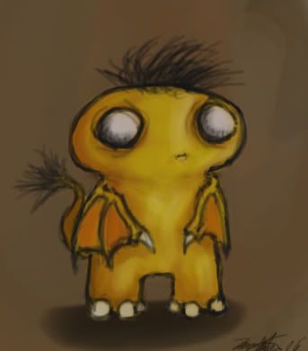 Did the lines last night and finished coloring it just a moment ago. Just a fun little doodle to kill time and keep from getting out of practice between pieces. Last edited by Grandmaster_Skweeb; 12-10-2006 at 01:56 AM. |
|
|
|
|
12-10-2006, 02:17 AM
|
#2848 |
|
DA-DA-DA-DAA DAA DAA DA DA-DAAAAAA!
Join Date: Dec 2003
Location: Zanzibar Land
Posts: 6,531
|
He looks rather sad and lonely.
Also, Gato is big pimpin'. 
__________________
|
|
|
|
|
12-11-2006, 03:31 PM
|
#2849 | |
|
Impressive...
Join Date: Jun 2005
Location: Here
Posts: 59
|
Thanks for the advice. I have/had been playing with the contrast and brightness of the face so I'll try to clear it up. The problems that I face are 1) when I up the contrast the light and dark points are too clearly defined and won't run smoothly together. 2) An increase of contrast also loses some of the blue color in the shaded regions turning it black which isn't really the effect I'm going for. And 3) if I just kick up the brightness a step, the colors are dulled. I like the deep, rich colors against the grays/whites. With enough patience and time and a few touch-ups, I think I can find the right combination to smooth it out.
Quote:
__________________
"Why can't rock music be about growing old?" -- Roger Daltrey of the WHO, who once sang "I hope I die before I get old." �We should be grateful for small blessings, as the gnome said when he blew off his hand when it might have been his head.� -- Lemuel, "Soulforge" �He�d been wrong, there was a light at the end of the tunnel, and it was a flamethrower.� -- "Mort" "As the philosopher Jagger once said 'You can't always get what you want.' " -- Dr. House, House M.D. |
|
|
|
|
|
12-12-2006, 08:14 AM
|
#2850 |
|
I'm somebody else these days.
Join Date: Aug 2006
Location: Same house same hill same bat channel still canada
Posts: 1,968
|
Ohh, that undo button. How I envy it's magnificent erasure powers. Thanks for the blur tips!
Is there anything like a burn/dodge tool in photoImpression? That brush would be the thing to tweak the contrast darker/lighter in select areas. Yeech, I understand completely why you don't wanna raise or lower the overall contrast. Overall blows up small planets.
__________________
"Life is like a box of chocolates. Cheap, thoughtless, perfunctory gift that nobody ever asks for." - CGB Spender
Super Perfundo on the Early Eve of Your Day. Last edited by Khael!; 12-13-2006 at 02:02 PM. |
|
|
|
 |
|
|


 Linear Mode

